A beautifully and brilliantly simple idea and execution which became a multi award winner, and became The Drum Award’s OOH of the decade.
A selection of work produced at VCCP. Not lots, just some things I like.
Typography and design development for the TfL staff abuse campaign
I was commissioned to create sticker illustrations to add life to this years festival comms. I only had a list of items, so was left to my own devices (and mind) with regards to execution.
I was commissioned to produce the illustration and typography for the 1990s limited edition bar poster, released as part of the 200 years celebration. I also designed the packaging for a specially created ‘Memory Box’, which was send to carers of people suffering from Alzheimers. Produced in partnership with the Alzheimers Society.
Consolidating TfLs (and the London Transport Museum’s) various educational school programmes into a coherent and consistent structure. The project involved naming, branding and delivery of guidelines.
Brand Identity (including development) for VCCPs new gaming arm. The logo and identity was designed in a way which enabled it to exist and adapt for any partners within the incredibly diverse gaming landscape.
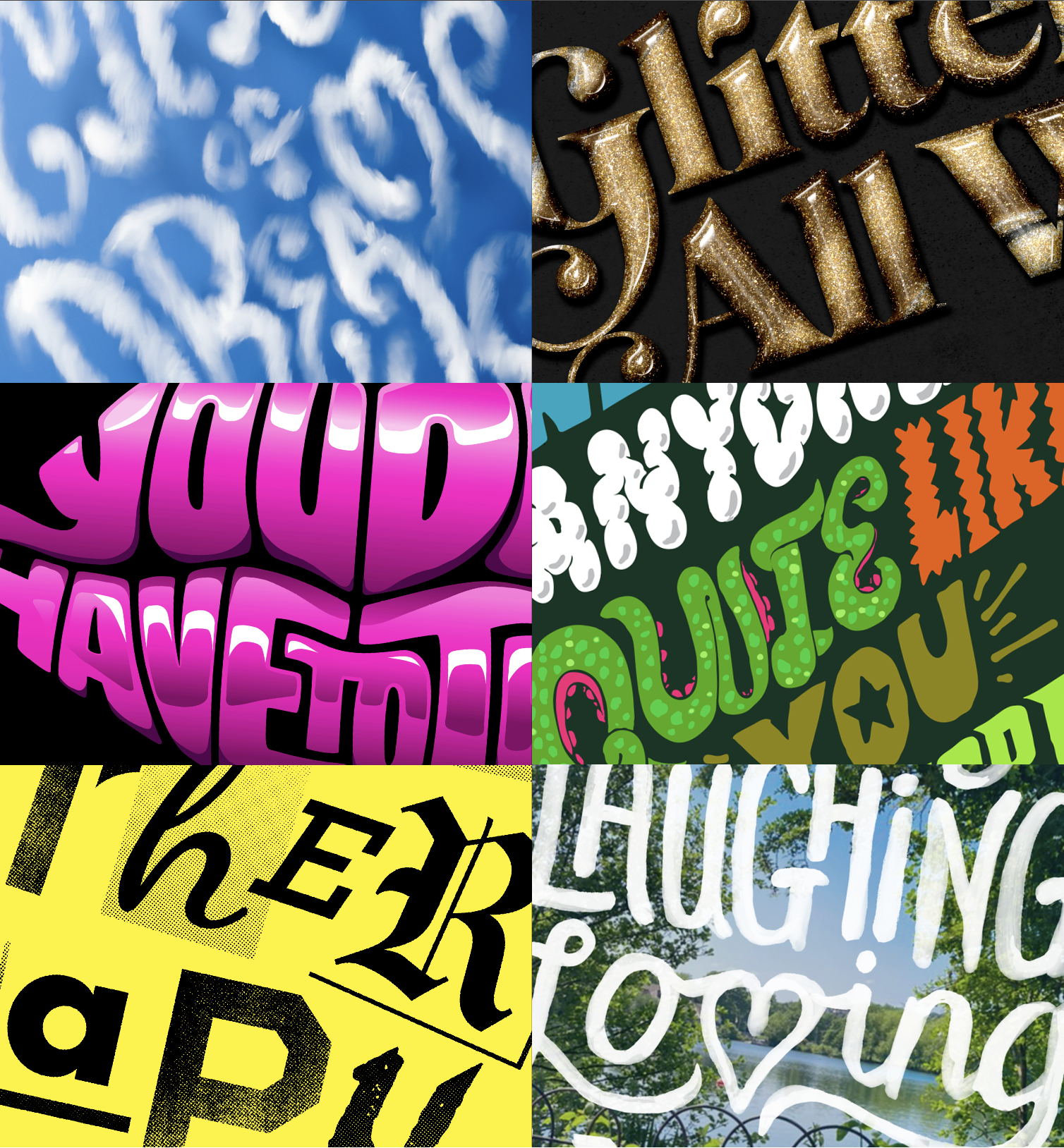
Personal and commissioned type/illustration work. For more take a look at my Instagram account https://www.instagram.com/heavybevel/
I designed the livery typography and layouts for this campaign, produced by TfL to raise awareness of the new low emission zone which will affect large vehicles in 2020.
Personal card game illustration project
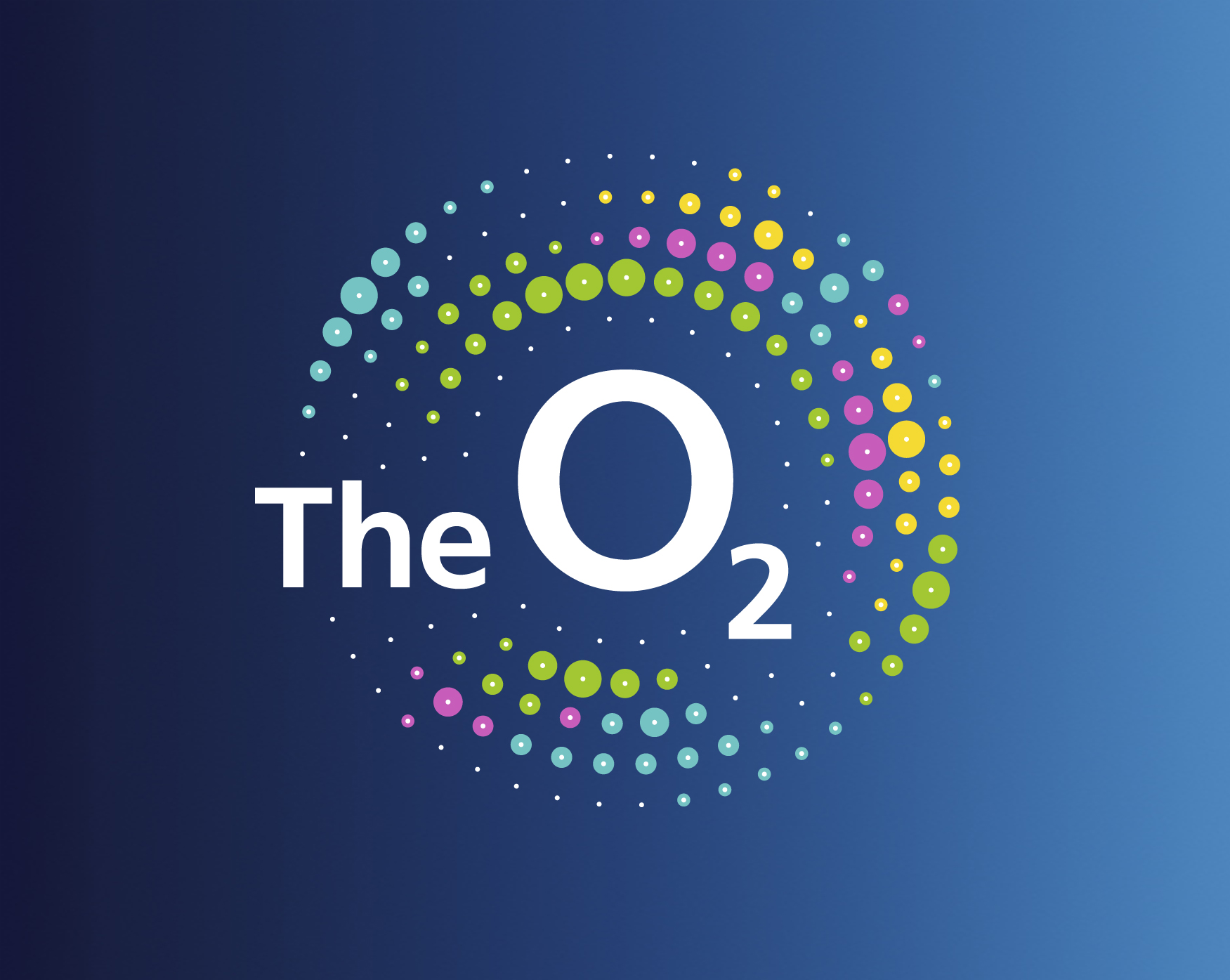
Expanding the O2 brand into the live entertainment industry.
Venue sign images courtesy of the internet.
The Cadbury Inventor incentive asked members of the public to create their own flavour of Dairy Milk. The top three were then produced and pitted against each other in a vote-off, the winner having their creation becoming a permanent product.
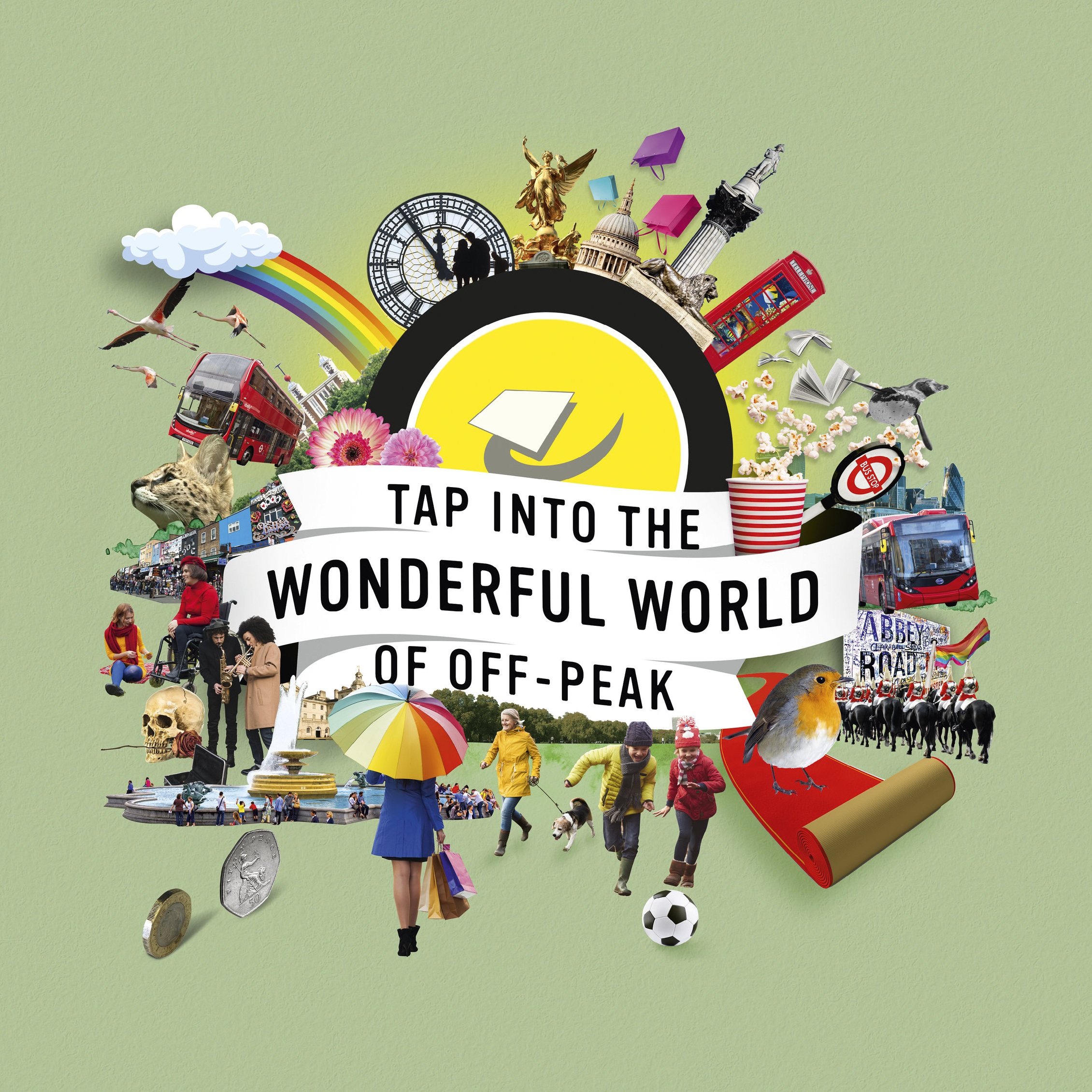
I created the campaign logo and a suite of seasonal collages to promote off-peak travel within London
I designed the logo and all packaging for this test product from Molson Coors several years ago. The brief was to produce a product which would appeal to the female market and complement the subtle and light flavour range.
VCCP created a campaign for Up at The O2, an experience where you can walk over the iconic destination. I was asked to create badges for digital use highlighting features and offers in a complimentary style to the original illustrations by Mads Berg.
http://madsberg.dk/
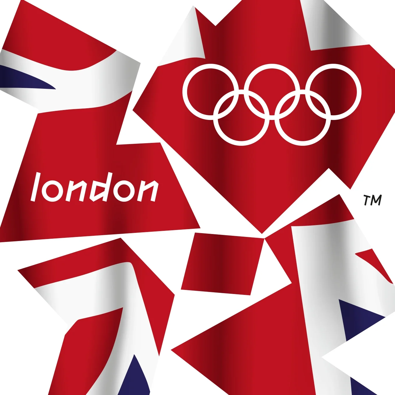
I created the Union Flag version of the iconic London 2012 logo for the 2008 celebrations following the announcement that the UK had won the Games. It was only to be used for the event but popped up rather a lot amongst the actual London 2012 Olympic Games merch.
Logo suite design + brand look and feel/guidelines for the online beer store
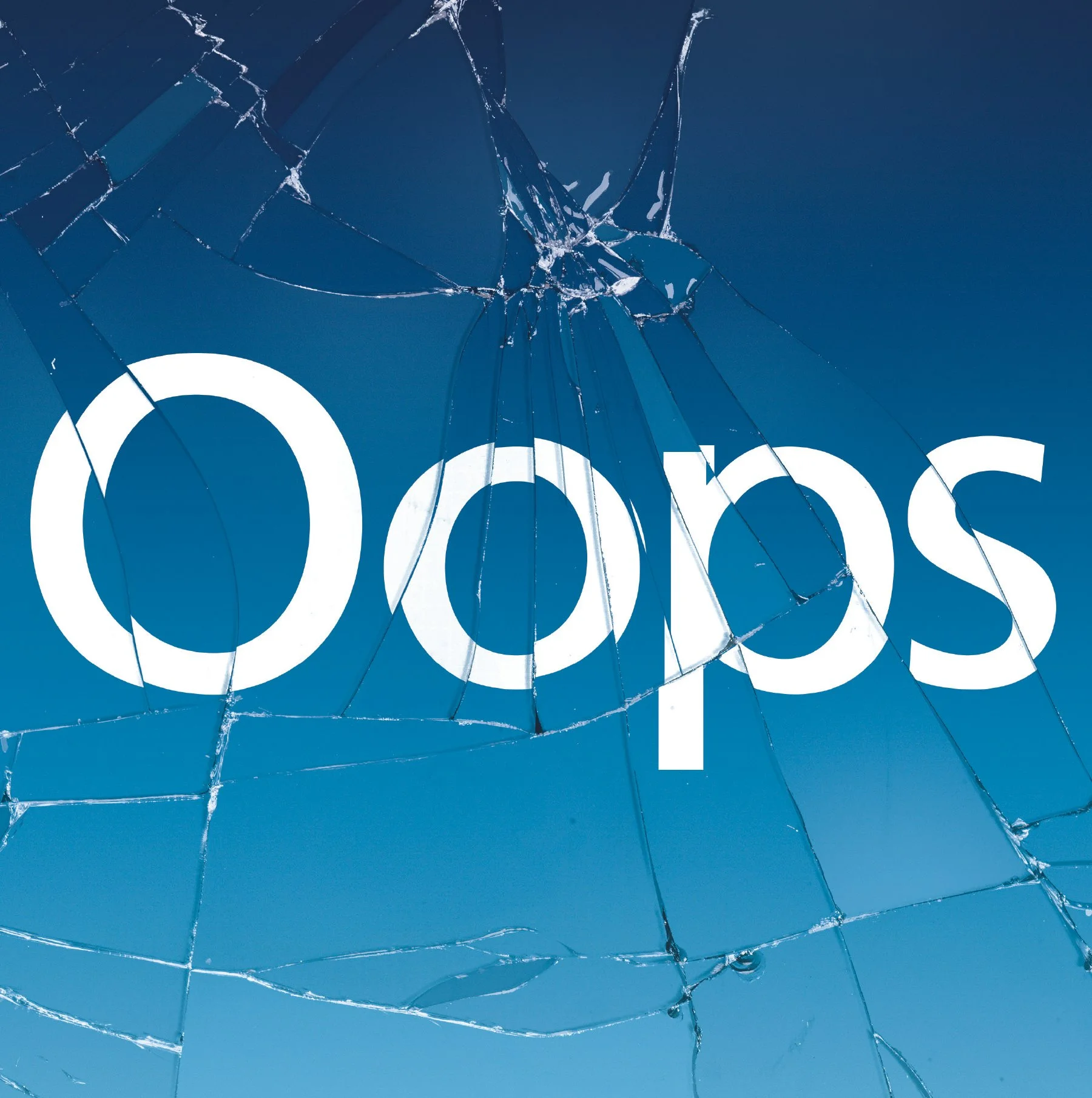
Pray they don't exist...
I initially sketched out the scorpion and octopus on a train journey to Scotland. This followed my initial deck illustration at the Pick Me Up event in London 2016.
Development and execution of the typographical styling for Virgin Games UK campaign, featuring Vlad the vampire.
Initial illustration work for VCCP's London Midland Railways Campaign